tailwind tricks
1、flex、grid布局可以使用gap来设置元素之间的间距,但是如果没有使用flex、grid布局,那么就可以使用space-x-1、space-y-1这种样式来设置间距。
这种方式比为每一个元素设置margin要好得多。
2、做动画的时候,要想到animate-开头的样式,先不管有哪些样式,就记住animate-开头即可,要先使用起来。
3、当页面需要展示文章时,可以使用@tailwindcss/typography这个插件,让文章的样式可以很简单的进行设置。
https://tailwindcss.com/blog/tailwindcss-typography
编写组件
很多情况下,组件需要有很多种样式,但是为一种样式编写一个组件显然是不好的。那么在一个组件里面,通过传参来显示不同的jsx代码,这样可以吗?其实也不好,因为jsx里面会有很多判断条件,不是best practice。
有一个解决办法,就是安装tailwind-variants库,npm i tailwind-variants tailwind-merge。参考:https://www.youtube.com/watch?v=I5U4hq0CAR4
然后编写组件,重点注意tv里面的两个属性。base表示所有类型都通用的样式,variants里面就定义组件上的属性和属性值。下面这个组件,我就定义了名为action的属性,有4种属性值。
x1import { tv } from "tailwind-variants";23const buttonStyles = tv({4 base: "rounded-lg hover:cursor-pointer",5 variants: {6 action: {7 add: "inline-flex items-center justify-center mb-4 px-4 py-2 text-sm font-medium text-white bg-slate-900 rounded-xl transition-all duration-300 hover:bg-slate-800 hover:shadow-lg hover:shadow-slate-200 active:scale-95 group",8 edit: "px-3 py-1.5 text-xs font-medium text-slate-500 rounded-lg transition-all duration-200 hover:text-slate-900 hover:bg-slate-100 active:bg-slate-200",9 del: "px-3 py-1.5 text-xs font-medium text-red-400 opacity-60 transition-all duration-200 hover:opacity-100 hover:text-red-600 active:scale-95",10 publish:11 "px-3 py-1.5 text-xs font-medium border border-slate-200 rounded-lg transition-all duration-200 active:scale-95 hover:bg-slate-900 hover:text-white hover:border-slate-900",12 },13 },14});1516type BlogButtonProps = {17 action: "add" | "edit" | "del" | "publish";18 name: string;19 type?: "button" | "submit" | "reset";20 icon?: React.ReactNode;21};2223export default function BlogButton({24 action,25 name,26 type = "button",27 icon,28}: BlogButtonProps) {29 return (30 <button type={type} className={buttonStyles({ action })}>31 {icon}32 {name}33 </button>34 );35}36使用起来很简单,只需要把定义的属性传递过去即可。重点就是这个action属性,是在tv里面定义的,ts定义必须要和tv里面的定义保持一致。
xxxxxxxxxx11<BlogButton action="del" name="Del" />
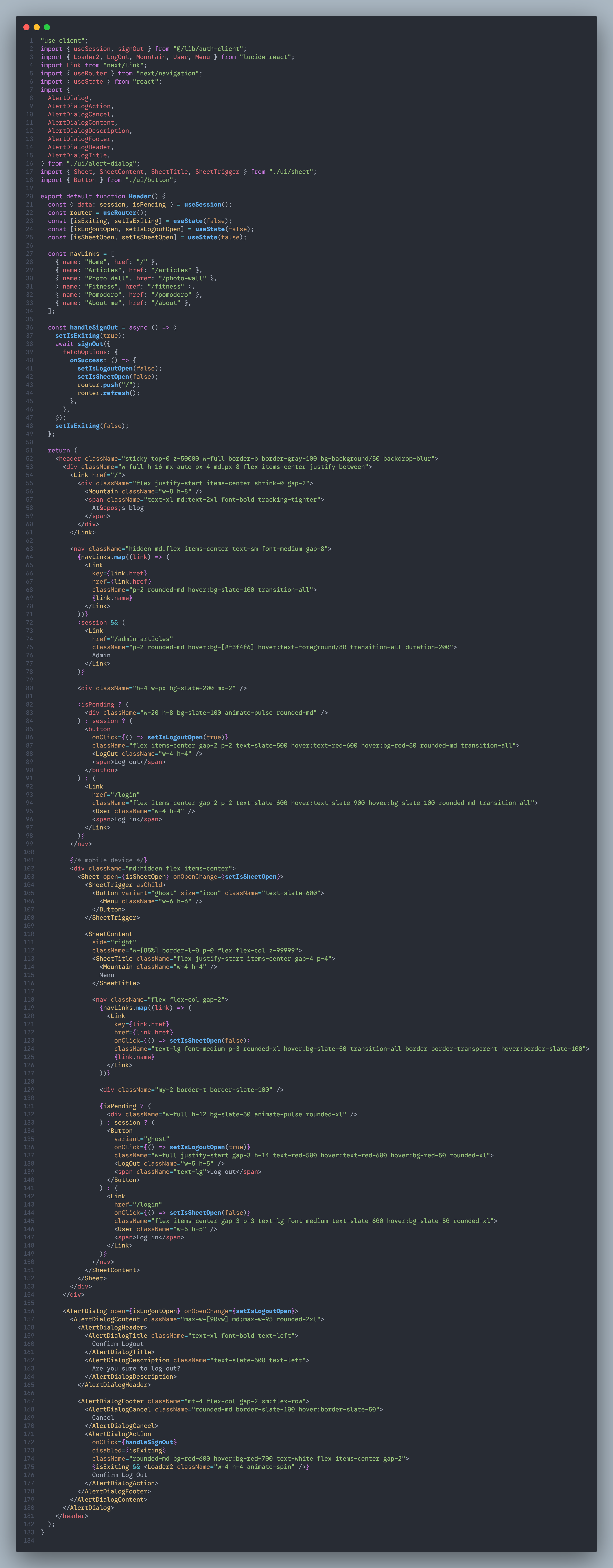
移动端样式适配
一般来说,先做PC端的样式,否则什么都想,很难做下去。所以按照PC端先做下去再说。
这一次的blog项目,我按照PC端先做,然后准备做移动端的适配。没想到将header适配之后,其余的页面都不需要怎么改,tailwind自己将样式给我们改好了。特别是运用了grid sm:grid-cols-1 md:grid-cols-2类似这种代码的地方,简直是完美呈现。
我想原因就是tailwind的样式,比如说mr-2,这种看上去是固定数值,但其实是rem数值,它会根据屏幕宽度来适配,非常好,又有了一个使用tailwind的理由了。
但是header必须要做布局的改变,否则会将页面撑的非常宽,造成整体页面不协调。
header怎么改呢?
- 在PC内容里面,添加样式
hidden md:flex,这样当屏幕宽度达到md情况时,就会显示出来;在移动端内容里面,添加样式md:hidden flex,这样当屏幕宽度达到md时,就会隐藏,小于md的时候,就会显示。 这个是第一点,也是最重要的一点。 - 采用shadcn的sheet来做菜单栏,默认显示右上角的一个按钮,点击这个按钮之后,就唤出sheet菜单栏。